Hi friends!
Gallery walls are a beautiful way to liven up a nursery or kids’ room – plus, they are a great way to display meaningful photos and mementos from a baby’s first few years.
Ever since our watercolor world map prints launched, we've been thrilled to receive so many messages (and lovely photos) of our prints in your beautiful nurseries and kids' rooms!
We've been asked a few times about gallery sets and different ways to incorporate more than one print into a nursery design, so we've put together this visual guide and some tips in today's blog post.
Step 1: Choose Your Overall Theme/Vibe
There are soooo many options when it comes to nursery decor, but we think most spaces look best with a cohesive vibe, whether it's fun and eclectic, light and peaceful, or rustic and bohemian. You could also organize the room around a central theme, like woodland animals, the jungle, travel, or even around a favorite children's book or movie.
Some things to keep in mind:
- How do you want to feel when you enter the room? Brighter, deeper colors will create a playful vibe, and lighter, softer colors could feel very calming.
- How often will the design change as your child grows older? Will the room eventually become a playroom or bedroom?
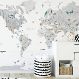
- Do you want a feature wall or accent wall? If so, you could consider a wall decal - you get a similar effect to a print, without the added fuss of framing and hanging. With wall decals, you are also able to create larger scale and more immersive wall murals. Check out some wall decal inspiration here.
Step 2: Collect Your Prints, Mementos, Toys Etc
We think that interior design should be about creating a space you love, and nurseries are no exception!
Tips for creating a cohesive look:
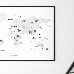
- Choose 1-2 key prints that you definitely want to use, and see if there is a connection in terms of color, style, or subject. For example, this world map is primarily blue with lots of light and colorful animals. In keeping with this print, you could choose other prints with blue tones, a watercolor style, or animals.
- You don't have to limit yourself to just prints - we've seen some beautiful galleries with black and white photographs, hanging mobiles, and wood art.
- As long as you have your main focal points, you can use smaller, neutral-toned prints to fill out your gallery wall.
Step 3: Choose Your Layout
We wrote a bit about different gallery wall layouts back in this post - and we're exploring each type of layout in-depth below :)
Minimal & Classic
For a balanced and elegant feel, these symmetrical and simple layouts are perfect. It can be easy for nurseries and playrooms to start feeling cluttered, so we love the idea of a simple gallery wall.

Top left: Illustrated State Maps // Top right: Earth & Moon Art Print Set // Bottom left: Solar System & Moons Art Print Set // Bottom right: Hawaii-themed nursery by Project Nursery
The Grid
Grids create the same symmetrical and calm feel, but are able to accommodate many more prints and photos.

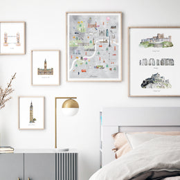
Top left: Paper Stories Illustrated Landmarks // Top right: Animal themed grid gallery wall by bishopandholland // Bottom left: Nursery decor from stylemepretty // Bottom right: Gold frame gallery set by tinymightyframes
Abstract Grid
These layouts play with the rigidity of the classic grid - creating more hierarchy and movement. We love that these layouts usually draw the eye to one larger focal point.

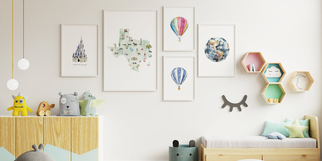
Top left: Illustrated State Maps & Landmarks // Top right: Illustrated Watercolor World Map & Hot Air Balloons // Bottom left: Gallery Wall by Artifact Uprising // Bottom right: Animal World Map and Hot Air Balloons
Internal Axis
Though these layouts break out of a rigid grid, they still have some alignment - either along one edge, or internally. The alignment helps create a feeling of cohesion. We love that this layout feels freer and more dynamic, allowing for more prints to be added in the future!

Top Image: Texas Illustrated State Map, Pink Minimal World Map // Bottom left: West Elm Gold Frame Gallery Wall // Bottom right: Crate & Barrel Gallery Wall
Eclectic
Dynamic and playful, this type of layout creates tons of visual movement around room, and would be a lovely way to incorporate lots of mismatching items and prints.

Top left: Paper Stories Illustrated Landmarks // Top right: Gallery wall by honestlywtf // Bottom left: Kids' room from @five_make_a_home // Bottom right: Customer gallery wall featuring illustrated state map
Step 4: Frame, Hang, and Enjoy
Tips for Hanging:
- It often helps to use some painter's tape to roughly mark out where each print of the gallery wall will hang.
- Make sure the center of the gallery wall is roughly around eye level, so it looks to scale with the rest of the room
- Don't worry too much about making it perfect! Prints are easy to swap in and out, and you can always add mementos to celebrate new milestones.
If you would like to see some more inspiration on different styles and types of gallery walls, make sure to check out our Pinterest board here!


