Turning a blank wall into the perfect gallery wall can be a daunting task. From selecting the artwork to framing to layout – there can be so many factors to consider.
Now, there isn't really a right or wrong way to hang a gallery wall - after all, your wall art should be a beautiful and fun way to express your style!
Below are five gallery wall types and the design principles that you can use to plan and achieve each style.

1. The Minimalist
Minimalist gallery walls are clean, elegant, and can add a sense of peace and calm to any space. They draw attention to a single accent piece or a complementary pair of posters.


Tips for Creating The Minimalist Layout
- Number of Prints: Use a smaller number of prints – a perfect pair or trio. For more examples, check out Paper Mundi's art print sets.
- White Space: For a clean, minimal look, choose prints with a larger area of white or "negative" space.
- Color: Make sure the color palettes work well together - with such a limited number of prints, color clashes will be quite visible. We love colorful prints as they can add a vibrant feel to an otherwise neutral room.
2. The Grid
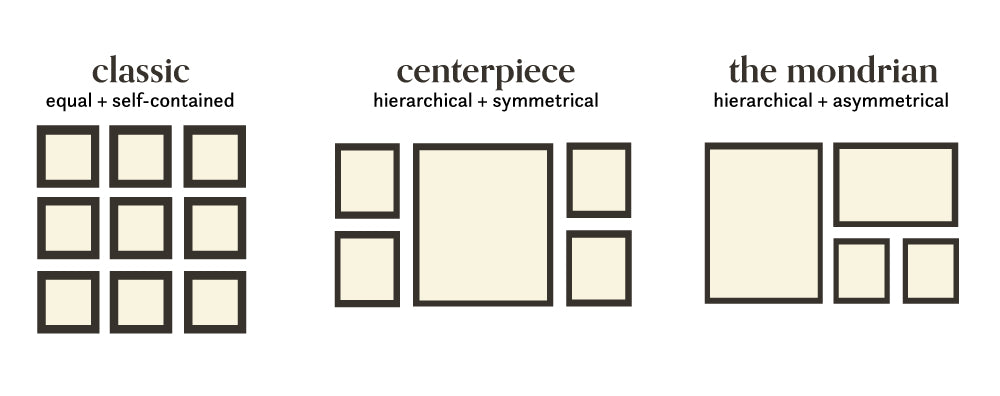
Easy and timeless, the grid gallery wall is a perfect standalone centerpiece for any room. A classic grid layout is the ideal layout to show of a series of prints or photographs of the same type.


Tips for the classic grid gallery wall
- Print Type: Find a series of prints or photos that carry equal weight – botanical herbs, Instagram photos, etc.
- White Space: Use more white space if the color palettes are not complementary - the white space will act as a buffer between images.
- Framing: Use the same frame to avoid one print standing out from the rest. This type of layout is all about visual balance and organization.

Tips for the grid variations (centerpiece & mondrian)
- Number of Prints: Choose 1-3 prints that you love and want to be the focus of the gallery wall arrangement. Add in a few more smaller prints (8x10 or smaller) that relate to the focal print in either color palette or subject.
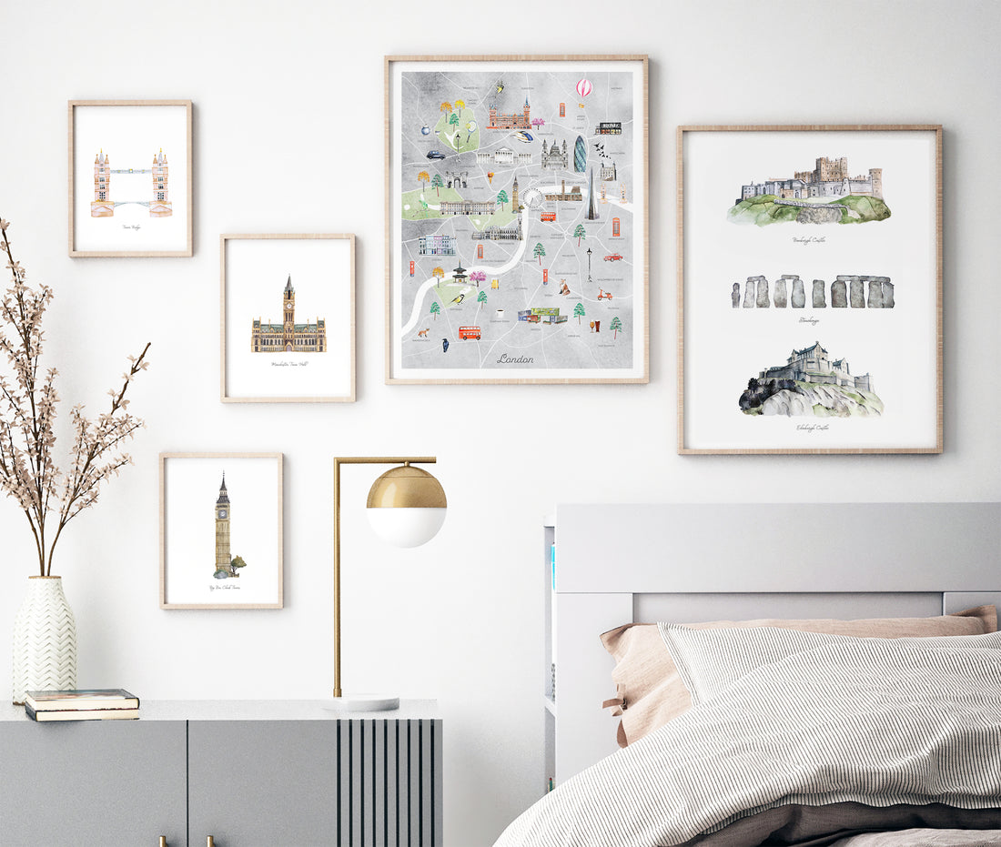
- Color: You can use the color palette of the focal art prints to create a cohesive layout. Or, like in the example above, the colorful prints on either side of the main print brighten up the overall black/white graphic theme. (P.S. All four prints are available for free as digital downloads - check out our digital printable library)
- Theme: This layout is perfect for any themed gallery walls like this one above, featuring a travel-related theme! Mixing together prints of different sizes is perfect for creating a sense of hierarchy.

2. The Axis
The axis gallery wall styles start to break away from a strict grid. However, you can intentionally align the prints to create cleaner lines and to highlight a specific feature of your room.
Since this style isn't symmetrical, it's more dynamic and can create a sense of movement around the room.


Tips for the Axis Gallery Wall
- Features: This layout is all about context, so look at the space in which you want to hang the wall. Are there any features you want to emphasize? For example, the bottom edges of the prints in a gallery wall can be aligned in order to highlight the living room sofa, crib, or wall details.
- Color: Like the grid gallery wall, you can choose a color palette based on the larger art prints that are the focus of the gallery.
- Composition: Juxtapose simpler, more minimalist prints - like the 'hello' graphic - with busier prints like the Viennoiseries and Pâtisseries prints.
2. The Eclectic

The eclectic gallery wall is a beautiful and functional way to display many different keepsakes, photos, and prints. With this salon style display, you can play with an endless combination of color palettes, frames, and themes.

Tips for Creating the Eclectic Gallery Wall
- Spacing: Modern gallery walls generally feature a smaller amount of space between prints - around 2-4" would be ideal.
- Modern vs Vintage: If you want to incorporate old family photos or other vintage items - and would like an overall vintage vibe to your gallery wall - you can use smaller prints with wider spacing in-between.
- Color: While you can experiment with a wider color range with more prints, it can be more effective to stay within a certain range - for example, primarily pastel prints, jewel tones, etc.
For more stunning gallery wall ideas, check out our Pinterest board featuring all kinds of gallery walls in different types of interiors!


